How big should a tattoo be?
Big enough for the important information to stay readable on the actual body part. There is no universal “correct inch size.” The right scale depends on detail density, contrast, anatomy, placement, how the piece wraps, and whether you want room for future tattoos around it.
Should this design be larger?
Keeping every detail usually means increasing scale. Keeping the small size usually means deciding which details matter most.
A simple design can still need different proportions once it has to wrap or sit on a tapered/curved body part.
The primary read should live where you actually want people—including you—to see it from a natural position.
If you may add more tattoos later, leave usable shapes around the piece instead of creating narrow awkward gaps accidentally.
THE BODY IS NOT A FLAT PAGE.
Arms rotate. Shoulders curve. Calves taper. Ribs move. A tattoo can be excellent flat artwork and still be wrong for the body if scale, focal placement and wrapping are not designed for the surface underneath it.
Same idea. Three sizes.
A design can technically be reduced to almost any physical size. That does not mean every version will communicate the same amount of information.
When a design gets smaller, the first thing that usually has to change is detail density. Fine interior shapes, tiny gaps, delicate textures and subtle value changes have less physical room to separate from each other.
2" vs. 4" vs. 7"
Conceptual example — not a universal minimum-size ruleGraphic & simplified
The core silhouette can still read, but secondary texture and micro-detail usually need to be reduced.
More breathing room
More separation is available between shapes, allowing added structure without making the piece feel crowded.
Composition opens up
Larger scale gives more room for transitions, texture, secondary elements and deliberate negative space.
Smaller doesn't mean “the same tattoo, just shrunk.”
A strong smaller tattoo is often a different edit of the same idea—simplified intentionally so the important part still reads.
The body changes the composition
Artwork designed on a tablet or sheet of paper is being judged on a flat rectangle. A tattoo is judged while wrapped around a cylinder, stretched over a shoulder cap, tapered down a calf, curved across ribs, or moving with a joint.
That changes what the viewer sees first, where lines disappear around an edge, and whether important parts of the design are visible from a natural angle.
Flat thinking
A tall rectangle can look balanced on a screen but feel pasted on when dropped unchanged onto a curved limb.
Body-aware thinking
The composition can bend, open and wrap so the body becomes part of the design instead of an obstacle underneath it.
Good flow doesn't mean every tattoo has to wrap.
Sometimes a deliberately framed, front-facing piece is exactly right. The point is that the choice should be intentional.
Placement changes the geometry
| Placement | What the body does | Design implication |
|---|---|---|
| Forearm | Rotates dramatically between palm-up and palm-down positions. | Check the focal point in multiple natural rotations before tattooing. |
| Upper arm / shoulder | Curves around a cylinder and over the shoulder cap. | Large focal elements may need to sit slightly forward/sideways rather than “flat centered.” |
| Calf | Tapers from knee toward ankle and wraps around a narrower cylinder. | Vertical flow often needs to account for taper so the design does not feel top-heavy or squeezed. |
| Ribs / torso | Curved surface that moves with breathing and posture. | Long lines and focal shapes should be checked in a natural standing position, not only while lying down. |
| Back | Large relatively broad field with shoulders and spine affecting symmetry. | Scale can be generous, but the design still has to respond to shoulder blades, spine and waist taper. |
| Hand / foot | Highly visible, mobile and relatively small working surfaces. | Dense micro-detail has very little margin; placement and long-term expectations need extra care. |
Different placements behave differently
“Arm tattoo” and “leg tattoo” are not single design problems. Different areas bend, taper and rotate in completely different ways.
Forearm
The forearm rotates. A design that looks centered with the palm down can shift when the wrist turns.
Shoulder cap
The deltoid is rounded. Circular or radiating compositions can use that dome instead of fighting it.
Calf
The calf widens and narrows. Long forms often need to follow the taper rather than stay mechanically rectangular.
Ribs / torso
The surface curves and moves with breathing and posture. Photos from one angle never tell the whole story.
Negative space is part of the design
Negative space is skin intentionally left between forms. It can separate focal points, make outlines easier to read, give shading room to transition and keep a dense composition from becoming visually noisy.
Everything packed together
When every shape competes for every inch, the eye can lose a clear hierarchy.
Designed breathing room
Open skin can separate forms and make the same number of elements feel much clearer.
Empty skin isn't wasted space.
Sometimes the untouched skin between tattooed shapes is doing some of the most important work in the entire composition.
Flat art vs. wrapping around the body
Wrapping changes what can be seen from any one viewpoint. That is not automatically a problem. Sleeves, large florals, biomechanical work, snakes, dragons and abstract compositions are often designed specifically to reward viewing the body from multiple angles.
The important decision is where the primary read lives. If the tattoo has a face, eye, word, focal flower, animal head or other dominant feature, the artist will usually think carefully about where that element sits when the body is at rest.
Decide what absolutely needs to be visible from the natural viewing angle.
Leaves, smoke, background, tails, stems and supporting shapes can travel around the body.
A stencil should be seen while standing normally, rotating the limb and changing posture before tattooing begins.
Detail, readability & the “micro” question
Very small detail is not automatically bad, and larger work is not automatically better. The issue is margin: tiny gaps and tiny tonal differences simply have less room for normal visual softening over time.
That is why an artist may recommend making a design larger, simplifying a texture, opening a gap, thickening a critical line, or removing one of several tiny objects from a composition.
Ask what specifically needs the room.
If an artist recommends going larger, they should be able to explain what part of the requested design benefits from that extra space.
The goal is not to turn every tattoo into a giant bold graphic. Fine-line work, delicate realism and small tattoos can all be intentional. The useful question is whether the amount of information matches the amount of physical space available.
How small can a detailed tattoo be?
Small enough only when the important shapes still have physical room to separate. There is no universal minimum size because a simple symbol and a realistic face contain completely different amounts of visual information.
Why does my tattoo artist want the design bigger?
Usually because you asked to keep more detail than the requested size can comfortably hold. Ask which specific details need the room. Often the choice is not “big tattoo or no tattoo”; it is “larger with the detail” versus “smaller with a simpler design.”
Can a tattoo wrap around my arm and still look good?
Absolutely. A wrapping design is not a mistake when it is intentional. Decide where the primary focal point lives and which parts are meant to reveal themselves as the arm rotates.
Why does my tattoo look crooked when I rotate or bend my arm?
Because skin and anatomy move. A tattoo can look perfectly aligned in one neutral position and distort when the joint or limb rotates. That is why stencil checks should happen in natural resting positions, not by chasing perfect geometry in every possible pose.
How much space should I leave if I want a sleeve later?
There is no exact inch rule. Tell the artist that future work matters. They can shape the edges and orientation so the open space around the tattoo remains usable instead of creating tiny leftover gaps.
Future tattoos matter too
A tattoo does not only occupy its own footprint. It also changes the shapes of the open spaces around it. That matters if you think you may eventually build a sleeve, patchwork arm, larger back composition or connected leg work.
A beautiful isolated tattoo can unintentionally create awkward narrow gaps that are difficult to use later. That does not mean every tattoo needs to be planned as part of a future bodysuit—it just means future plans are worth mentioning.
It can frame itself and use surrounding negative space as part of the finished look.
Leave shapes around it that future pieces can realistically occupy without forcing filler everywhere.
The first tattoo can become an anchor, so orientation and placement may matter more than they would in isolation.
What to tell your artist
You do not need to arrive knowing the perfect dimensions. A useful consultation gives the artist the constraints that actually matter and leaves room for them to solve the geometry.
Where do you want it?
Give a general body area and mention any nearby tattoos, scars or work gear that affects placement.
How big are you comfortable going?
A rough range is enough: palm-size, half forearm, shoulder cap, full outer thigh, etc.
What details are non-negotiable?
If three flowers or one facial expression matter more than everything else, say that early.
Do you want future work nearby?
A sleeve plan, patchwork plan or “this will probably stay isolated” changes how the surrounding space can be used.
Bring the idea. Bring the placement. Bring the priorities.
Then let the artist solve the dimensions that give those priorities enough room to work.
See scale in actual work
The final version of this guide can cross-link directly into gallery pieces at different physical scales: compact forearm work, shoulder-cap compositions, half sleeves, large realism and pieces that visibly wrap around anatomy.
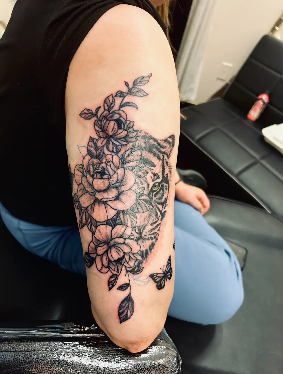
Tiger & Peonies
See how a vertical composition uses the arm →
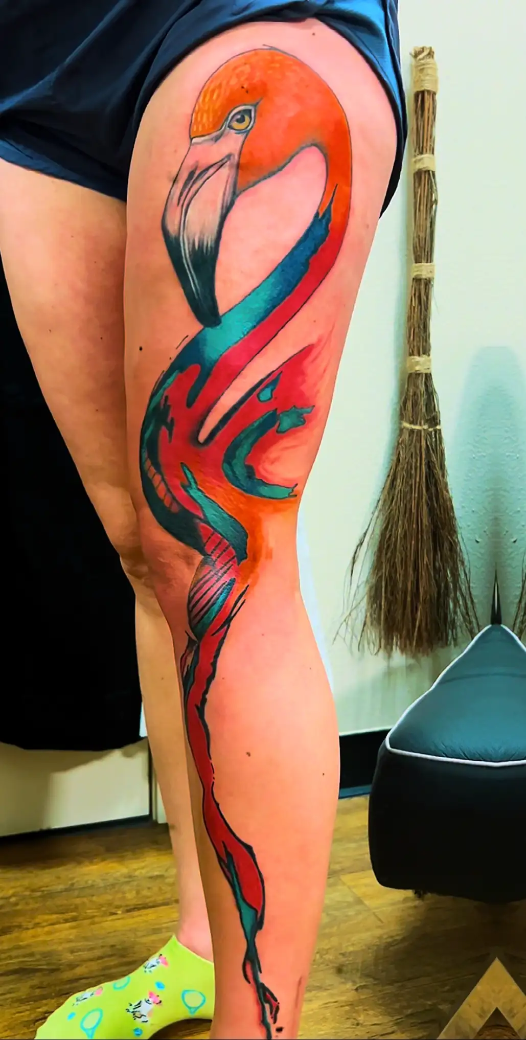
Color Leg Piece
Explore larger-format work →
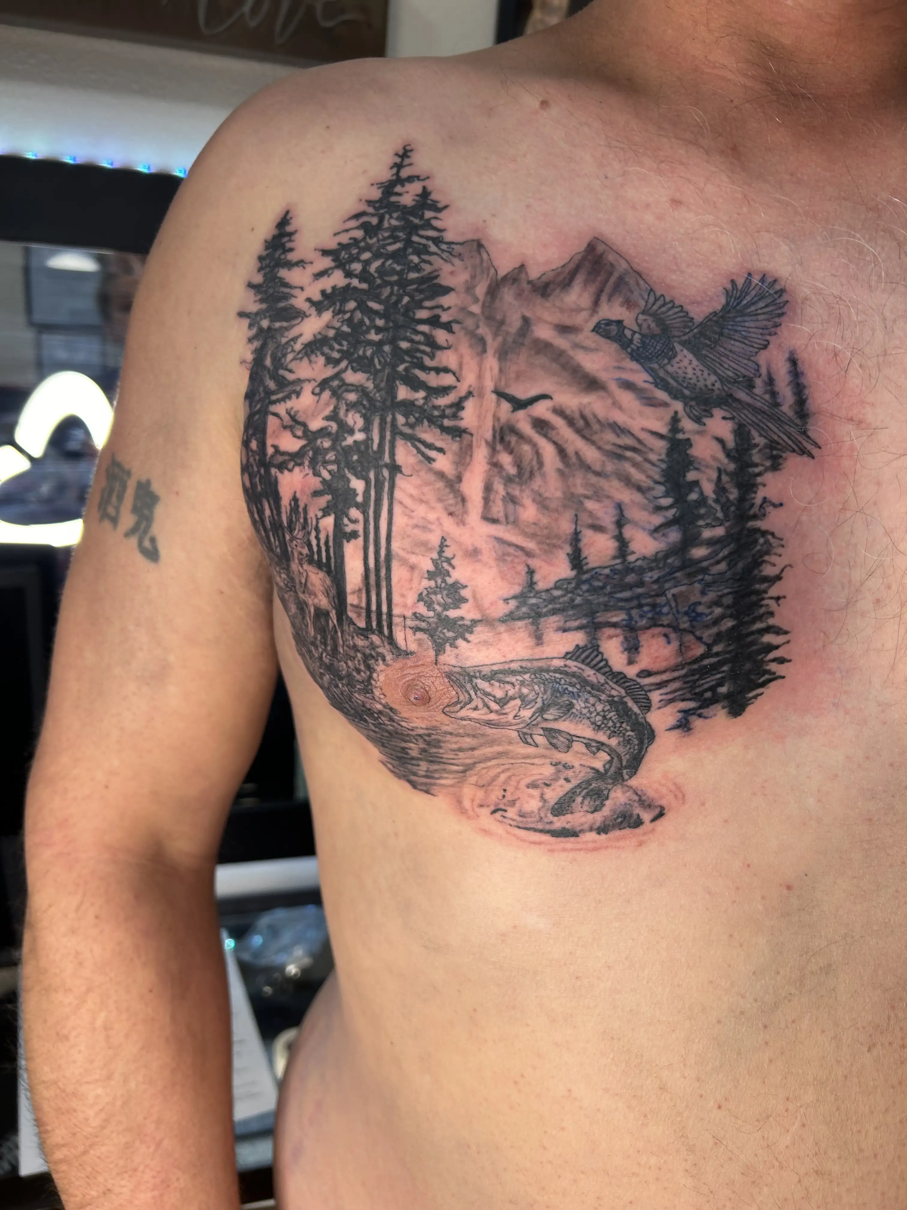
Chest Composition
See work designed around a broader surface →
Keep the question connected.
BL-INK guides are built as a system. Jump to the next question that actually affects your tattoo.
Color & Skin Tone
Once scale and placement make sense, contrast and pigment choices still have to work on the actual skin.
Read Color Guide →See scale on real bodies
Use the gallery to compare how different compositions occupy arms, legs, chests and larger body areas.
Explore Tattoo Work →Tell the artist what comes next.
If you want a future sleeve or larger connected work, that belongs in the design conversation now.
Start a Tattoo Project →