How skin changes what you see
Tattoo pigment is placed into the dermis, below the epidermis. What you see from the outside is therefore not simply “ink color.” It is the combined visual result of pigment inside the skin and the skin above it.
Same palette. Different base.
Conceptual visualization · not a color guaranteeSkin tone & undertones
Artists sometimes use terms like warm, cool, neutral, or olive undertone when talking about color planning. Those can be useful artistic shorthand, but they are not a complete biological classification system.
The more useful conversation is usually: what colors create enough visual separation, what kind of contrast the design needs, what the artist has seen heal well in their own work, and what the client actually wants the finished tattoo to feel like.
Contrast matters more than a rigid color chart
There is no honest universal chart that says one skin tone gets one approved palette and another skin tone does not. Strong tattoo design depends on relationships between values, saturation, line structure, open skin, and neighboring colors.
Higher visual separation
Clear darks, open space, strong shapes, and intentionally saturated areas can help different parts of a tattoo remain distinct.
Very subtle separation
Low-contrast colors placed close together can be harder to distinguish, particularly once the tattoo is healed and no longer has fresh-skin brightness.
That does not mean every tattoo needs to be black or extremely dark. It means the palette and composition should be chosen together.
What actually changes the way color reads?
Instead of asking for a universal “best colors for skin tone” chart, use the variables an artist can actually design around.
| Variable | What it changes | Better question to ask |
|---|---|---|
| Value contrast | How clearly adjacent shapes separate after healing. | Where are the darkest anchors, midtones and open skin? |
| Saturation | How strongly a color family reads relative to neighboring colors and skin. | Which colors need to feel bold, and which can stay subtle? |
| Scale | How much physical room a transition or highlight has to remain visible. | Does this design need to be larger to preserve the color differences? |
| Line structure | Whether the image still has readable boundaries if color softens. | Does the design need stronger structure around the focal areas? |
| Open skin / negative space | Creates visual breathing room and can increase perceived contrast. | Where should the skin itself remain part of the composition? |
| Healed skin + lighting | Changes how every pigment is perceived compared with a fresh, glossy photo. | Can I see healed examples in similar palettes? |
What an artist is actually looking at
Good color planning is broader than “which colors show up?” An artist is also looking at how the design will read as a whole on a moving, three-dimensional body.
Where are the darks, mids and open skin?
Readable tattoos usually have a clear hierarchy rather than every part fighting for the same visual weight.
Do neighboring colors distinguish themselves?
Two colors that look dramatically different on a phone screen can become much closer once healed in skin.
How much room do the details have?
Tiny color changes and tiny highlights have less room to remain visually distinct than larger shapes.
Where will this tattoo actually live?
Curvature, body movement and even how a placement is usually lit can change how the complete composition reads.
Choosing color
Black can provide strong structure, but it should not be treated as the only possible answer for deeper skin. Saturated color can work beautifully too. The best evidence for a particular artist's approach is their own healed portfolio.
- Look for healed examples, not only freshly photographed tattoos.
- Pay attention to contrast between neighboring colors.
- Consider how much open skin is part of the composition.
- Ask the artist what palette decisions they would change for your exact placement and skin.
Can color tattoos work on dark or deeper skin?
Yes. Color can work beautifully on deeper skin. The useful design problem is not “which colors are allowed?” It is how the artist uses contrast, saturation, scale, line structure and negative space so the tattoo reads clearly once healed.
What tattoo colors show best on darker skin?
There is no universal ranked list. Saturated pigments and clear value separation can be useful, but what reads best depends on the complete palette, surrounding values, scale, placement, the individual skin, and the artist’s technique.
Does red tattoo ink show on darker skin?
It can. Red is not automatically “good” or “bad” for a particular skin tone. Its visibility depends on the red pigment, surrounding colors, value structure, saturation, scale, lighting and the healed skin above it.
Does white tattoo ink show on darker skin?
White ink can be visible, but it is not opaque paint. It does not sit on top of skin like white marker on paper. Its healed appearance is filtered through the skin like other tattoo pigments and can shift substantially from the fresh result.
Does skin undertone matter for tattoo color?
It can be useful artistic context, but it is not a precise biological color-matching formula. Terms like warm, cool, neutral and olive help artists discuss palette relationships, but the actual tattoo still needs to be designed around value, contrast, scale and healed appearance.
Fresh color vs. healed color
Fresh tattoos often look unusually vivid. The skin may be irritated or swollen, the surface can appear glossy, and the image is being photographed before the epidermis has fully recovered.
Fresh
Brighter, wetter-looking, and often higher-contrast because the skin is newly tattooed and still reacting.
Healed
The more useful reference for long-term color planning. Surface shine and acute irritation are gone, so the actual settled palette is easier to judge.
That is why BL-INK's gallery should eventually make Fresh and Healed visible metadata instead of treating every tattoo photo as equivalent.
Why website color swatches are imperfect
Screens emit light. Skin reflects light. Cameras adjust exposure and white balance. Ink formulations differ. Healing changes the surface appearance. A digital swatch can help communicate a direction, but it cannot promise an exact healed color.
What about white and very light pigments?
White and pale pigments are not opaque paint laid over the body. They sit within skin just like other tattoo pigments, and their visible appearance can shift as the tattoo heals and ages.
That makes them useful in some designs, but they should not be treated as a universal way to “brighten” any palette or override the skin underneath.
What to bring to the color conversation
You do not need to arrive with a perfect pigment recipe. It is usually more useful to bring the things that communicate the mood, subject and color relationships you actually care about.
Bring examples of color families, art, photography or tattoos you respond to—not just one exact screenshot to copy.
Tell the artist what matters most: bright color, subtle color, strong contrast, softer realism, or preserving a particular visual mood.
If you have healed tattoos already, those are useful references. Also mention unusual scarring or significant past skin reactions.
Healing & individual skin response
Every tattoo is also a skin injury, which means individual healing response matters. If you know that your skin tends to develop unusual scarring, keloids, significant pigment changes after injury, or persistent skin reactions, tell your artist before the appointment and consider speaking with a dermatologist.
See it on skin
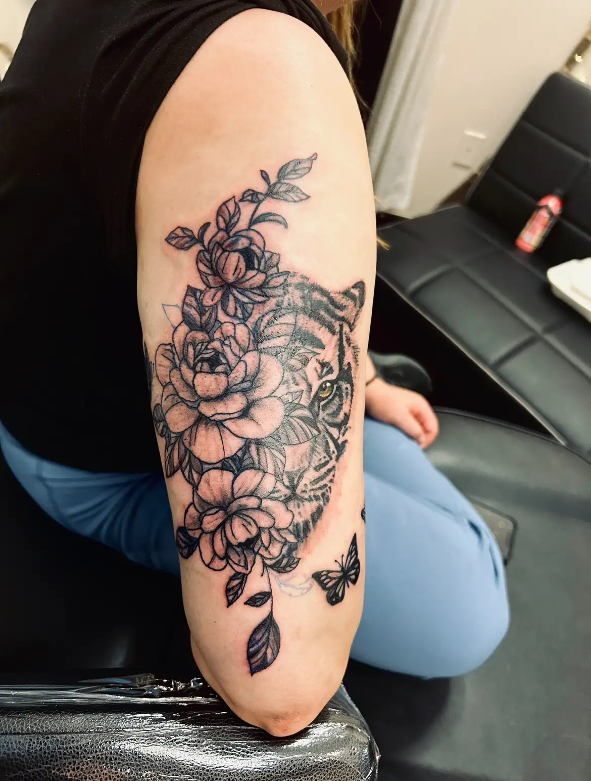
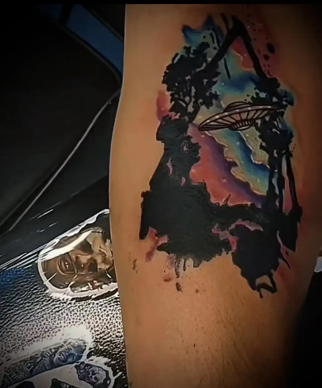
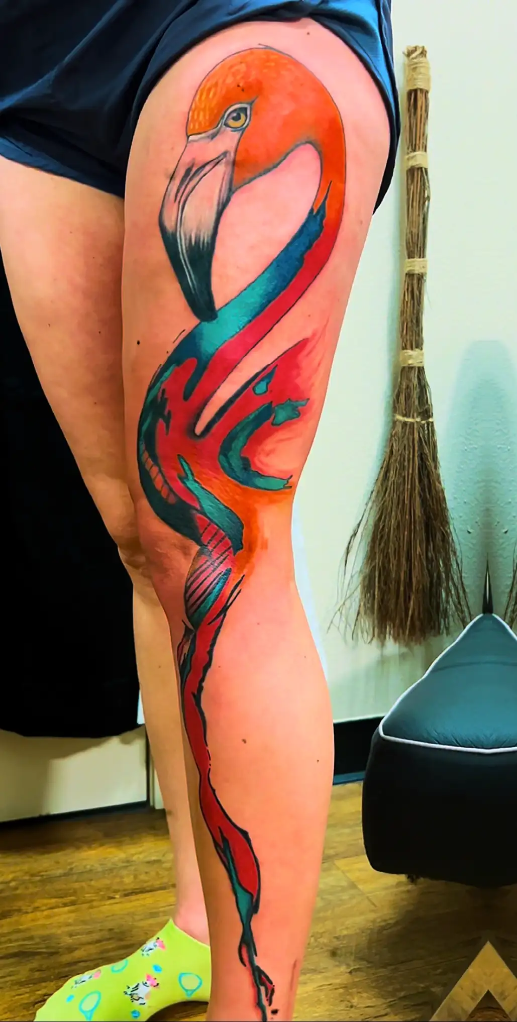
The best version of this page eventually ends with real BL-INK examples—not Photoshop simulations. Healed photos let clients compare actual artist work across palettes, styles and skin tones.
Keep the question connected.
BL-INK guides are built as a system. Jump to the next question that actually affects your tattoo.
Size, Scale & Body Flow
Color is only one design variable. Scale, placement, negative space and anatomy change how the whole tattoo reads.
Read Design Guide →See color on real skin
Use the gallery to look at actual tattoos instead of treating digital color chips as a promise.
Explore Color Work →Bring references—not a rigid color chart.
Show the artist what you like and let the palette be designed for the actual piece and skin.
Start a Tattoo Project →Sources & skin-health references
Color/design guidance on this page reflects tattoo design principles and studio education. Medical references below support the skin-reaction and scarring portions of the guide.
American Academy of Dermatology — Tattoo skin reactionsAmerican Academy of Dermatology — Keloid scars overview